Project 1
UVs
Issues and trouble shooting:
Warping around nose and chin area.
- Went into UVLayout and placed the nose on its own separate shell and cut seams on the bottom of his jaw to allow a bit more stretching.
Make sure your UV checkerboard is correctly aligned! I had to find a new one after it was pointed out to me.

Displacement
Issues and trouble shooting:
Displacement map wasn't able to pullout certain facial features like lips and wrinkles which meant the model still looked blobby and lacked shape.
- Exported a higher res version of the model so the displacement map had a better base to work off, giving the model a sharper look .
Some pore detail was either too blurry or not fully realistic.
- Have to go back into ZBrush to smooth out certain areas such as the brow and head wrinkles, clean out areas near the nose and eyes and reapply pores to the correct scale.
Normals
Using a normal map helped bring out a lot of the smaller details such as old faded scars which play a big role in Cecil's story as a character, but in some areas it made some details too detailed, so in the future I might need to make some area of the map less noticeable and let the displacement do most of the heavy lifting.
Issues and trouble shooting:
Tangent maps were not showing up or if they did show up they were inverted and very low detail.
- When exporting out of ZBrush some color channels must have flipped so you have to go into the Arnold tab in the Bump node and check off Flip R & G channels, which will un-invert the map and read correctly. The same effect can also be achieve by flipping the channels before exporting out of ZBrush. Secondly, in some cases if Alpha as Luminescence is checked on the texture node the map might have trouble being read.

Future improvements
Try laying out displacement map textures in Mari instead of ZBrush in order to avoid overlaying pores and other details on top of each other and hopefully get a sharper amount of detail.
Project 2
Shading
Issues and trouble shooting:
AiStandard subsurface was causing green fringes in creased areas such as the lips and ears.

- These weird colors where being caused because my model was ridiculously small compared to my overall world scale, this meant I had to scale my scene up, this also meant I had to re-export mas such as displacement which was written for a way smaller model and would get distorted if placed on a larger version of the model. Although it meant having to re-export maps and scale lights and objects this gave me an opportunity to scale everything to actual world size which will mean more realistic results.
STILL GETTING GREEN FRINGES EVEN WHEN SCALED
- Although they were really blurred, there where still areas that where slightly green, so I decided to use the AiSkin shader since I could, make one of the skin layers green to neutralize the green that was appearing with my previous color combination. Yet even when we started trouble shooting the skin shader we still had some green I later realized that the green channel should be place as the first(shallow scatter) layer of skin in order for it actually be able to neutralize the red.
Getting dark shadows with objects with refraction in their shaders like the outer eye geo and lenses in the glasses.
- Refractive caustics is not checked off by default so light was not being let through to illuminate these areas creating darker shadows than those area should have had.

Eyes with and without enabling Refractive Caustics:


Enabling caustics lets light actually hit the inner eye, making it slightly brighter, but this small difference really adds to the life of the character. Cecil is a very optimistic, go-lucky person, so his eyes should always look lit and lively; to add to this his irises should look a bit bigger than normal to add an honest connotation to his face (the distortion on his glass lenses might also add to this but also a higher IOR for the outer geo of his eyes). All of this combines makes him feel a bit more youthful even though physically he is still an older man.
Shading Style:
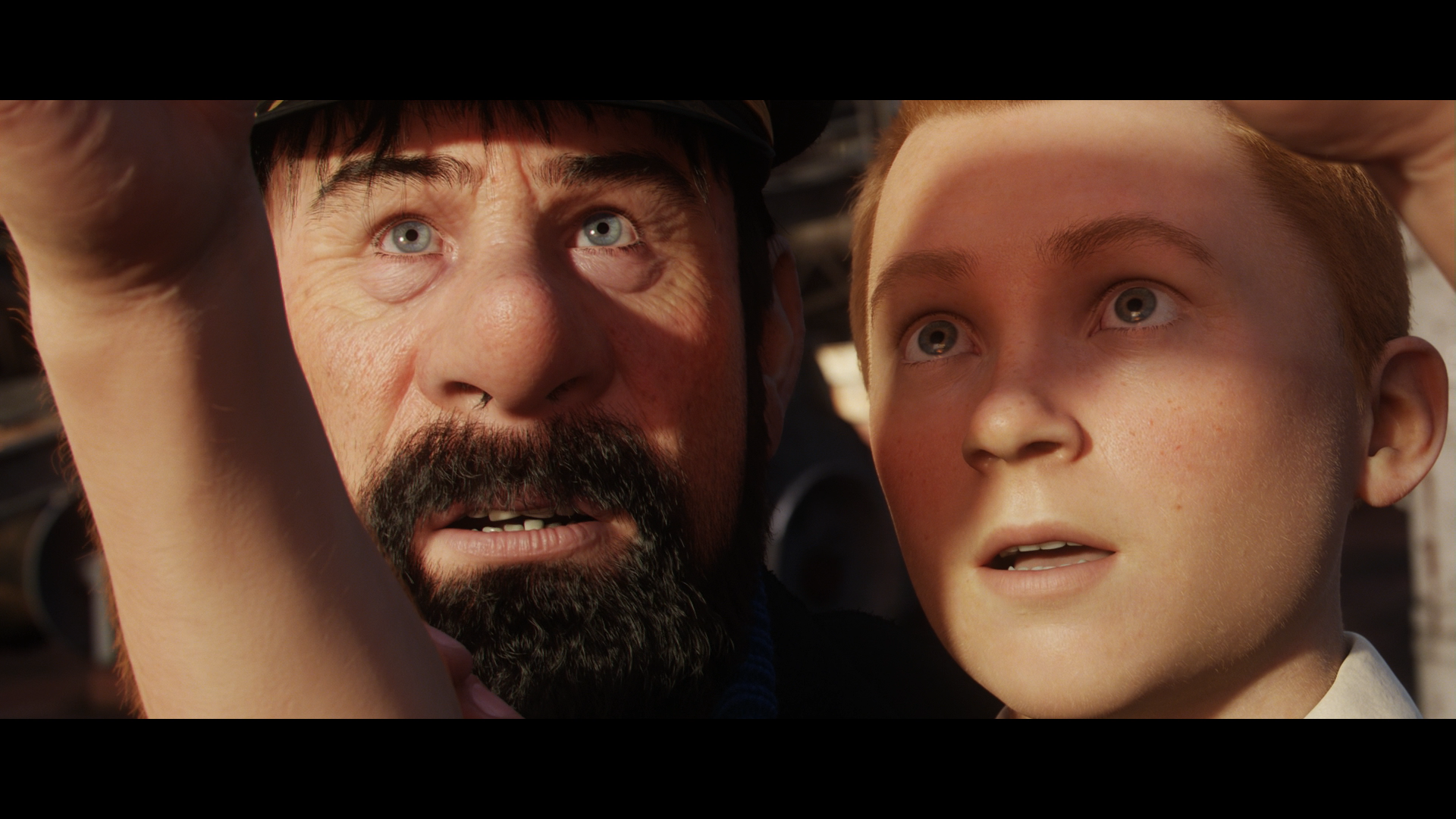

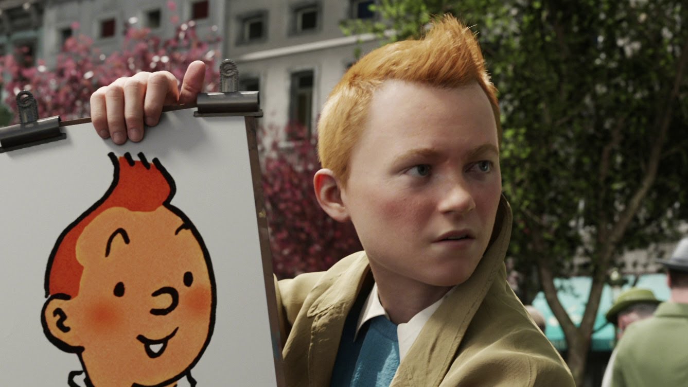


I chose the movie Tin Tin as my shading reference because their characters, shading wise, look very realistic but they still hold a stylized look overall. Using screenshots from the movie as reference helped pin points key things I should fix, on top of that, recreating a similar lighting scenario like that of the scenes helped me choose better values for my SSS and specularity since I could compare the falloff of my shader to that of the movie. Compared to Tin Tin,my character still needs a more "solid" SSS, right now he is still looking a bit too soft. My specularity's roughness might also bee to soft at the moment which would add to the velvity feel he has right now.


